
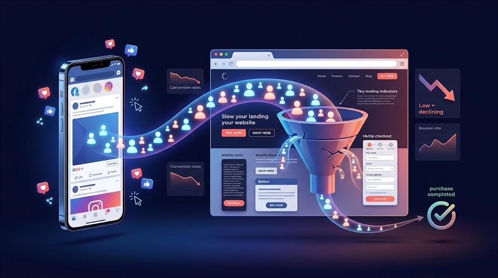
Scroll through Facebook long enough and you will see hundreds of ads competing for attention. Some get clicked. Very few lead to a purchase. The gap between click and conversion usually has nothing to do with the advertisement.
Where the Real Problem Lives
Plenty of marketers reach for the ad manager when results disappoint. They rotate creatives, tweak audiences, and adjust budgets. But if the ad is earning clicks at a reasonable rate, the creative is not the issue.
Something is going wrong after the click. The visitor lands on a page and immediately loses interest. They hit the back button and return to their feed, costing you money with nothing to show for it.
Every social media click represents a micro-investment from your budget. That investment only pays off when the site behind it can capture the visitor's interest and convert it into action. A poor page kills that opportunity in seconds.
The sections below walk through the main ways web design influences your return on ad spend. Each one is actionable and worth reviewing before you invest another dollar in campaigns.
How Design Builds or Breaks Trust
When someone discovers your brand through an Instagram story ad, they arrive cold. They have no history with you. Their first impression is formed entirely by the page in front of them.
If that page looks neglected — blurry images, inconsistent spacing, broken navigation — the visitor concludes you are not credible. That conclusion forms in under a second. Recovering from it is almost impossible.
Strong visual presentation does heavy lifting here. Thoughtful use of whitespace, clear headings, and consistent branding all communicate professionalism. Visitors perceive care and competence before they read a word of copy.
Layout structure reinforces that perception. When information flows in a logical sequence and the eye is guided smoothly, visitors feel oriented rather than confused. A qualified website designer understands the psychology behind visual flow and uses it to build confidence on arrival.
The Cost of Slow Loading
A polished landing page that takes five seconds to open might as well not exist. Mobile users from social feeds are conditioned for speed. They do not wait.
Research quantifies this behavior consistently. Bounce rates rise steeply as load time crosses the two-second mark. By the time a page reaches five seconds, a significant share of traffic has already disappeared.
Each bounce represents wasted ad expenditure. You paid Facebook or Instagram to deliver that person to your door. They left before stepping inside.
Underlying factors like uncompressed media files, redundant scripts, and shared hosting limitations all contribute to sluggish performance. Addressing these requires planning during the build phase. A reliable web design company bakes performance optimization into every template and page from the start.
Aligning What the Ad Says With What the Page Shows
There is a familiar frustration among online shoppers. You see an ad for a discounted pair of sneakers. You click excitedly. Then you land on a cluttered homepage with no sign of that offer.
That mismatch is a conversion death sentence. The visitor's intent was specific and time-sensitive. Forcing them to navigate or search betrays the trust the ad established.
Message alignment means the landing page reflects exactly what the ad communicated. Same product, same imagery, same language, same offer. The transition should feel seamless rather than jarring.
When visitors feel the page was built specifically for the ad they clicked, engagement stays high. They are more willing to read, explore, and ultimately act. An experienced website designer can produce campaign-matched landing pages that maintain that continuity from first touch to final step.
Prioritizing Small-Screen Users
Walk down any street and watch how people use their phones. Most hold the device in one hand and operate it with their thumb. That is the environment your site must perform in.
Designing for a laptop first and retrofitting mobile as an afterthought produces predictable failures. Buttons become hard to tap. Lines of text extend beyond the viewport. Navigation menus collapse into awkward dropdowns.
A mobile-first approach avoids all of this by starting with the smallest screen and scaling upward. Font sizes stay readable. Interactive elements are generous and well-spaced.
Thumb-friendly placement matters enormously. The lower half of a phone screen is the easiest area to reach. Primary actions belong there.
When users cannot interact comfortably on a phone, they disengage quickly. Since most social traffic is mobile, this directly erodes your paid media returns. Partnering with a web design company that builds responsive layouts from the ground up removes this risk entirely.
Simplifying the Conversion Point
Up to this point, the design has supported the journey from click to interest. The final stage — the form or checkout — is where interest becomes revenue. This is also the most fragile step.
Long forms create unnecessary resistance. Each additional input field gives the visitor another reason to leave. Trim requests down to the absolute minimum needed to complete the transaction.
Checkout follows the same principle. Requiring a new account before paying is one of the most common reasons carts get abandoned. A guest checkout option eliminates that obstacle.
Design details at this stage carry extra weight. Generous field spacing, visible labels, and a bold action button all reduce hesitation. Security indicators placed beside the payment area reassure users that their information is safe.
Even small friction at checkout compounds into lost revenue across an entire campaign. A website designer with conversion experience will simplify these critical touchpoints until the process feels almost automatic.
Ensuring Your Tracking Works Properly
Beyond what visitors see, your site architecture determines what advertising platforms can measure. Disorganized page structures and inconsistent URLs undermine tracking accuracy. This is not a cosmetic issue.
The Facebook Pixel depends on clean signals to train its delivery algorithm. When it receives incomplete or misleading data, it struggles to find the right audience. Campaigns become less efficient and more expensive.
A logically structured site supports precise tracking at every step. Each conversion event is tagged and reported accurately. This gives the algorithm the quality feedback it needs to improve targeting over time.
Structural flaws in a site create measurement blind spots that accumulate. A web design company experienced with analytics implementation can audit your setup and ensure data flows correctly into every platform you use.
The Real Priority
Before scaling your Facebook or Instagram campaigns further, take a hard look at the experience waiting for the people you are sending. Paid traffic amplifies whatever is already in place. A strong funnel scales efficiently. A broken funnel scales losses.
Run through each landing page on your phone right now. Time how long it takes to load. Check whether the message matches the most recent ad creative. Try completing a purchase yourself.
Any friction you discover is a direct tax on your ad budget. Fix those problems before spending more on acquisition. That is where the real leverage lives.

 English
 French
 Deutsch
 Turkish
 Italiano
 Russian