
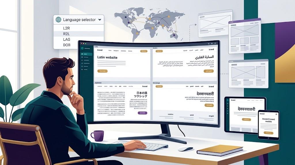
A single-language site can feel effortless to manage. Content flows predictably, layouts stay stable, and design iterations move quickly. The moment international expansion enters the conversation, every system you've built gets stress-tested simultaneously. Languages, scripts, cultural norms, and SEO signals all compete for attention at once.
The instinct most teams follow is to translate first and adjust later. That sequence puts you behind from the start. Multilingual design is an architecture and systems challenge that happens to involve translated content. Addressing it after the English site is locked down means revisiting decisions that should have been flexible from the beginning.
Account for the Physical Space Languages Require
Consider how differently languages occupy screen real estate. Finnish and German compound words can stretch a short English label into something two or three times wider. Thai script stacks vertically with diacritical marks above and below. Arabic reads from right to left, reversing the entire visual hierarchy.
Containers designed around exact English dimensions will buckle under these variations. Buttons overflow. Headline text truncates mid-word. Navigation menus stack in unintended ways that make the site look broken.
Every interactive element should absorb significant text expansion without structural failure. A web designer experienced with global projects will stress-test layouts with the widest expected translations before sign-off. Fluid sizing and percentage-based widths handle variation far better than rigid pixel values.
Build right-to-left support into the foundation even when no RTL language is scheduled for launch. Embedding directional logic early costs little. Extracting it from a fully built left-to-right codebase costs a lot.
Position Language Controls for Instant Recognition
A visitor arriving from a localized search engine result has no patience for a hidden language toggle. If they can't switch languages within a glance, they'll return to their search results and try a competitor instead.
A few placement rules that hold up across user research:
- Anchor the selector in the header, near the top-right corner. That position carries the strongest recognition across international browsing patterns.
- Display each language name in its native script. "Italiano" communicates faster to an Italian speaker than the word "Italian" written in English.
- Eliminate flags as language identifiers. Flags represent nations, not languages. Portuguese serves audiences in Lisbon, Brasília, and Luanda—no single flag works.
- When a specific page lacks a localized version, serve the closest match with a transparent notice. Never present a generic error page.
A website designer who has shipped multilingual interfaces before will embed these conventions into the header component early. Retrofitting language navigation after launch introduces friction that could have been avoided entirely.
Evaluate Font Choices Against Every Target Script
Selecting a typeface based solely on its Latin character set is a frequent mistake. That elegant display font may render Greek glyphs with uneven stroke weight. Its CJK characters might appear noticeably lighter or heavier than the Latin equivalents.
Spacing characteristics also shift between scripts. Latin-tuned letter spacing often looks wrong applied to Devanagari. Line heights comfortable for English paragraphs can clip tall Burmese or Thai characters.
A web designer who audits typography per script catches these inconsistencies before they reach production. Adjusting base font size, leading, and tracking for each writing system ensures consistent readability. Japanese body text typically benefits from increased line height at smaller sizes. Arabic content needs mirrored padding to feel properly balanced.
These per-script refinements are invisible when done well and immediately noticeable when skipped.
Deliver Content That Feels Locally Produced
Grammatically accurate translation is necessary but insufficient. A case study referencing a North American market leader means little to someone reading in São Paulo. Cultural idioms that land perfectly in English can confuse or alienate audiences elsewhere.
Localization specialists embedded in each target market understand which examples resonate and which references fall flat. They rewrite sections that don't translate culturally, swap imagery to reflect local contexts, and adjust tone to match regional communication norms.
A website designer coordinating with localization teams can surface layout constraints before translated content arrives. If a localized paragraph needs to be 40% shorter or significantly longer, advance knowledge prevents rushed template modifications during deployment.
Each regional version should contain only content relevant to its market. Translating pages for products or services unavailable locally creates clutter and confusion. Intentional curation always beats exhaustive translation.
Choose a URL Structure That Your Team Can Sustain
How multilingual URLs are organized affects search engine crawling, indexing, and domain authority distribution. The three standard models each present different trade-offs:
- Subdirectories (example.com/ja/) consolidate authority under one domain and reduce operational complexity. Most teams find this model the most sustainable.
- Subdomains (ja.example.com) offer clearer organizational boundaries but fragment ranking signals.
- Country-code TLDs (example.co.jp) deliver strong geo-targeting signals while multiplying infrastructure requirements around hosting, monitoring, and certificates.
Select the model your team can maintain reliably over years, not just through initial launch. Whatever structure you implement, configure hreflang tags with precision. Mismatched annotations cause search engines to serve incorrect language versions or interpret localized pages as competing duplicates.
Design Around Regional Scanning Preferences
Reading patterns are culturally shaped, not universal. Visitors in certain markets expect dense information layouts with specifications and details visible immediately upon landing. Other audiences prefer generous whitespace with concise copy and layered disclosure.
A website designer studying regional UX norms can tailor templates per market rather than applying one design universally. Examine how prominent local brands in each target region structure their homepages. Note the content density above the fold, the placement of primary actions, and the depth of the navigation hierarchy.
These patterns reflect deeply ingrained cultural processing habits. Adapting to them signals awareness and typically improves both engagement and conversion metrics.
Validate Every Localized Version With Native Reviewers
Automated QA catches missing translations and broken links. It will never catch a headline that sounds awkwardly formal in everyday German or a product description that reads as unintentionally comedic in Brazilian Portuguese.
Recruit native speakers for every target language to evaluate the complete localized experience. Assess tone, cultural fit, naturalness, and whether the page feels authored by someone who understands the local audience. A web designer who schedules native review into the project timeline avoids last-minute scrambles before regional go-live dates.
Allocate real budget for this step. Skipping it produces sites that look localized but consistently feel foreign—the exact opposite of what global expansion should accomplish.
Build Operational Workflows That Scale Gracefully
Every content update multiplies across language versions. A single campaign launch triggers coordinated changes across markets. Without structured systems, versions drift out of sync and stale content accumulates quietly.
Adopt a CMS that handles multilingual content natively. Assign ownership for each language version so accountability is clear. A website designer who understands content operations will advocate for platforms that reduce friction in translation handoffs and minimize manual duplication. Outdated localized content damages trust more than having no localized version at all.
Schedule periodic audits across all language versions. Regular consistency checks surface misalignments before they compound into a credibility issue that takes weeks to resolve.
Approach Multilingual Design as a Continuous Commitment
The most successful international sites share a common starting point. A web designer Singapore, a content strategist, and a localization specialist aligned on goals and technical constraints before development began. They anticipated the complexity rather than encountering it during launch week.
Start with flexible architecture that accommodates different scripts, reading directions, and content lengths. Respect each audience's cultural expectations around design density and communication style. Invest in workflows and tooling that keep every version current without overwhelming your team. Sustained refinement informed by real audience behavior is what turns a multilingual site into a genuine global brand experience.

 English
 Spanish
 Deutsch
 Turkish
 Italiano
 Russian